PowerPoint Tips Everyone Should Know (Part 1)
A well-designed and engaging presentation not only captures your audience’s attention but also helps to convey your message clearly and effectively. However, creating a polished PowerPoint takes more than just slapping together a few slides and adding some bullet points. In this blog, we’ll explore the essential steps you need to take to create a professional-looking PowerPoint that will impress your audience and help you achieve your goals. Read on for PowerPoint tips everyone should know for making your presentation flawless.

Fonts
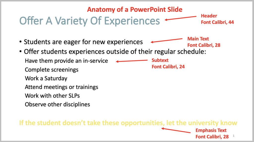
There are many fonts out there to choose from! However, a good rule of thumb is to stick to 3 fonts to use throughout the presentation. You will need a font for the main text, headers, and accent or emphasis text. It’s important to note here that you should be consistent with font size too throughout the presentation. So, the size of the main text, headers, and subtext should be consistent on each slide.
PowerPoint has a plethora of fonts to choose from. You can also find new fonts, both free and paid, on websites such as TeachersPayTeachers.com or Fonts.Google.com. As far as graphics goes, keep your fonts professional but you can add a bit of personality. You want to stay away from fonts that are very bubbly as these may be difficult to read for some people and look very elementary. Remember your audience is filled with professional adults, not kindergarteners.
Colors
The recommended background color for slides is white. This gives you more flexibility with font colors and images. It also gives it a clean, simple look and is easier to make small changes if you want to update your slides over the years.
When it comes to font colors, stick to the rule of 3 as well! Choose 3 font colors to use throughout the presentation. You will want a color for the main text, headers, and accent lines. The most commonly used main text font color is black, followed by dark gray or brown/black. I stick with black because it is the default in PowerPoint and I don’t have to change it for each slide.
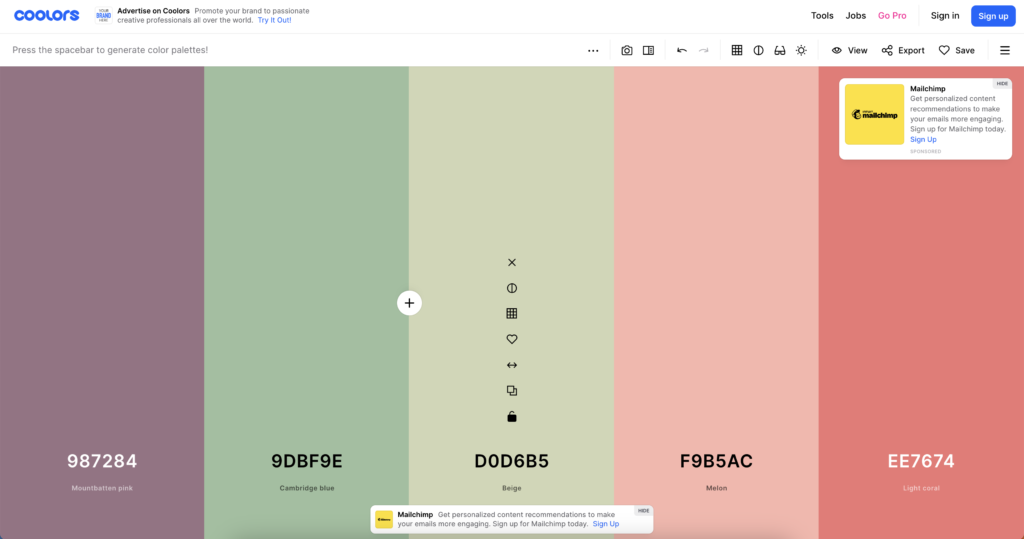
The colors for your headers and accent lines is where you can add a splash of personality, but you still need to keep it simple and professional. It’s not the time to sport your alma mater’s colors, unless you are speaking on their campus. Colors like yellow or pastels may be difficult for audience members to read. A free website for generating a color scheme is Coolors.Co/Generate. It will start out with a visual field of 5, but you can decrease this to 3. Then play around with the options by mixing and matching until you find what you like. A simple way to grab a color is to use the eye dropper in PowerPoint. To use this, click on font color, then “more colors,” then select the eye dropper and move to the color sample you want.

Wording
This is what sets seasoned professionals apart from newbies. With wording, less is more.
Slides are meant to be a visual aide to help with comprehension and memory. You are there to present the material and share necessary information with the audience. So, you should limit the wording on the slides to the most important key points. Each bullet point should be a single line. An exception to this would be if you are sharing a quote or excerpt. Otherwise, you get one line per point.
Animations
People can either read or listen, they cannot do both at the same time. Therefore, you need to limit the information you give to the audience at one time. Otherwise, the audience will read your slide instead of listening to what you are saying.
The last of the PowerPoint tips for your presentation is to use animations! Once you have your single line, bullet points, add animations so the lines come in one at a time as you are ready for them. Just like with fonts and colors, I think it’s best to limit the animations you use to 3. In my presentations, I have an animation for main text and another for subtext.

What tips do you have about designing PowerPoint presentations? Let us know below ⬇️

One Comment