PowerPoint Tips Everyone Should Know (Part 2)
PowerPoint has long been a staple tool for creating captivating presentations, whether for educational purposes, business meetings, or public speaking engagements. In part 1 of this series of PowerPoint Tips Everyone Should Know, I discuss the basics:
-Keep it simple and visual
-Remember the rule of 3
-Use consistent and readable fonts
-Leverage slide transitions and animations
Here are three more tips that will elevate your PowerPoint skills and help you deliver engaging and impactful presentations. 👇
Visuals
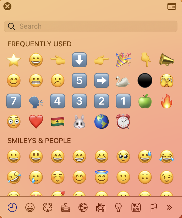
Strategically adding visuals will give your slides an extra edge and help your audience retain content. A fun and simple visual you can use is to add emojis to your slides. I use emojis to emphasize key bullet points or if I ask the audience a question with multiple-choice answers. Thankfully, there is a shortcut for the emoji keyboard! On a Mac, the shortcut is: ctrl+cmd+space. On a PC, the shortcut is: Windows logo key + (.)

You should also use pictures to spruce up your slides and keep the audience’s attention. My favorite website for free, commercial-use images is UnSplash.com. Next time you need images for your presentation, check out this website and see what you find. You can also find free, fair-use photos on Google Images as well at Google.com/Advanced_Image_Search. Once you find the Google image to use, you can click on it and drag and drop it into your slides. No need to do a screenshot + upload 😀
Videos
Videos are a fabulous way to keep your audience’s attention but you must also use them strategically. Too many will be distracting and take time. You can insert videos directly into your PowerPoint, although this will increase the file size. My best tip for inserting videos from YouTube is to have them immediately start where you want them to start. To do that click on ‘Share’ and check ‘Start at ____.’ My other tip is to include the hyperlink in the slide as well. Sometimes PowerPoint is fickle and won’t play the video on the slide. Having the link ready to go will help you get to the video fast. This also gives credit to the video creators 😉 So, two birds, one stone.

Another fun and simple way to add video is to use GIFs. A website with free, commercial-use GIFs is Giphy.com. To insert it into a slide, just right-click and then paste. This won’t work on all of them, but will on most of them. There are tons of GIFs to choose from. I personally love the ones with animals and they usually get a chuckle from the audience.
Shapes
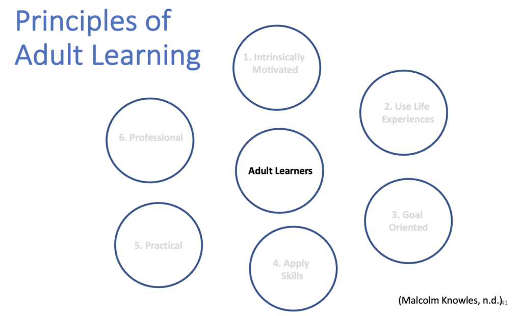
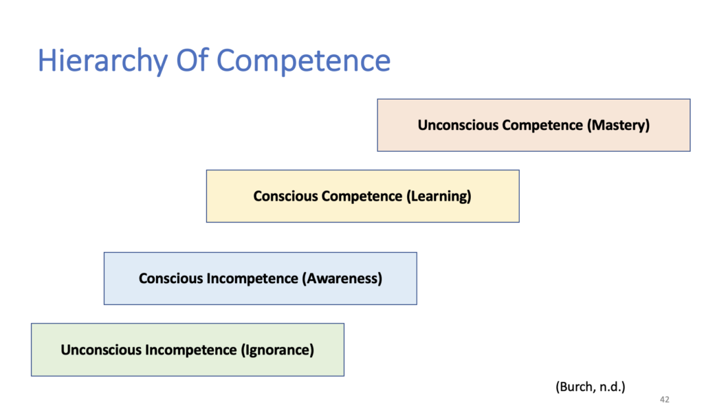
Use shapes in your presentation to change how information is presented. Once you have your shapes inserted, you can then add animations to direct the listener’s eyes around the slide. In the first example below, I use circles to list the principles of adult learning instead of just listing them in bullet points. I added animations to highlight the principle I want to discuss with the click of a button. In the second example, I use rectangles to list the stages in the hierarchy of competence and also added animations to change the color to highlight the stage I am discussing. This helps keep the listener from reading ahead. You can add an extra animation to unhighlight something at the same time you highlight a new point.


What are your PowerPoint tips for memorable presentations? Let us know below. ⬇️
